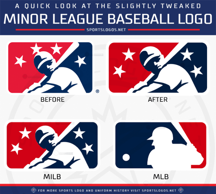
Minor League Baseball continued it’s off-season of change by tweaking its primary logo, bringing it more in-line with that of Major League Baseball’s iconic Batterman symbol.
While the “Prospect Icon” remains (the batter design in the middle of the logo), the colours have been darkened to match MLB, the four white stars have increased in prominence, and the shape and size of the logo now mimicks that of the Major League design.
“We built this new Minor League Baseball, so now how do you tell that story visually?”, Minor League Baseball’s VP of Business Operations Kurt Hunzeker told SportsLogos.net in a phone call. “How do you visually tell the story of this new alignment between Major League Baseball and the 120 teams that comprise of Minor League Baseball? How can we show our fans and our team’s communities that this is the start of a bigger, better Minor League Baseball.”

The change to the logo comes after an off-season in which Minor League Baseball was completely restructured and realigned with teams shifting across all levels from league to league, and even from class to class. Several teams were moved to MLB partner leagues, others were removed altogether, while a few independent league teams made the shift over to MLB affiliated baseball for the first time.
At first glance, you may not notice much difference to the logo, personally my first thought was “oh, they darkened the colours”, but the biggest change when comparing side-by-side and what will make the largest impact is the overall shape of the logo.
“It’s a bit wider and a little shorter. The previous logo was more upright but we definitely wanted to have that similar container shape as Major League Baseball to show the alignment while still having our distinct brand,” Hunzeker explained. “The colours are opposite of each other [compared to Major League Baseball], and the Prospect Icon is still the same icon Minor League Baseball has been using for decades, but that new container shows that while there is a new alignment with Major League Baseball, we are still our own fun-centric brand.”

In addition to the colour change and shape shifting, the four stars are larger than before and now have had some special significance attached to them — the four levels of the Minor League system.
“The four stars remain,” Hunzeker continued. “They actually gain more prominence now with four, very clear levels of player development within Minor League Baseball: Triple A, Double A, High and Low A, as we are defining it.”
This new logo will roll out slowly over the course of the 2021 Minor League season, you’ll see it applied digitally first on the league’s social media accounts and websites, it likely won’t begin appearing on player uniforms, courtesy the back of team caps and jerseys, until the 2022 season.
