[ad_1]
It’s been 30 years since Sampdoria lifted the Scudetto. Where has the time gone? As part of the celebrations, These Football Times and Cult Kits have joined forces for a weekend of fun, with features, a podcast, giveaways and more all online.
For a side who only began to make a splash in the world of Serie A in the early to mid-1980s, Sampdoria are these days seen as an iconic staple of calcio.
Sure, fortune was on their side. By the time wealthy oil tycoon Paolo Mantovani began to bankroll Samp, Italian football’s reputation around the world was already sky-high. Then there was the shrewd practice of signing stars such as Graeme Souness and Trevor Francis from abroad that helped spread the side’s reputation globally.
But perhaps more than any of this, there was the kit. The white, red and black band on a blue base was inspired by the merger of Sampierdarenese and Andrea Doria back in 1946, the red and black coming from Sampierdarenese and the white and blue from Andrea Doria. Once blended with the shield of Genoa’s patron saint St George, the result might just be the most aesthetically pleasing football kit on earth.
Here are ten of our favourite Blucerchiati jerseys.
1983/84: HOME (PICTURED 1984)

As worn throughout most of Samp’s early glory years in the 80s, the iconic NR Phonola sponsored design is an absolute beauty.
1989/90: AWAY

Sampdoria played out the 1989 Cup Winners Cup final in an outrageously graceful kit. It’s an outfit almost more akin to the golden era of F1 than the football pitch but, honestly, it’s just great.
1990/91: HOME

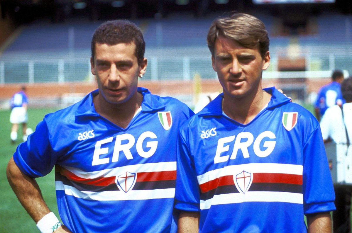
Quite simply the greatest shirt in the side’s history. The Asics design made sure Mancini, Vialli and the rest of the side looked good on the way to capturing Samp’s first and only Scudetto.
1992/93: HOME

The 1992/93 home shirt epitomises classic style, with the lace-up design being complemented by the Coppa Italia shield to the chest.
2003/04: THIRD

If you thought Samp’s kits looked good on a blue or white base, you ain’t seen anything yet. The black version was magnificent.
2004/05: HOME

After over a decade with Japanese brand Asics, Samp made the switch to Kappa and they did not disappoint. Utilising Kappa’s trademark skin-tight fit of the early 2000s, the design was clean, simple and classy
2010/11: HOME

While Kappa seemed to stick firmly to an ‘if it ain’t broke don’t fix it’ motif throughout the noughties, the simple addition of a white collar in 2010 gave the shirt a really well-balanced look.
2011/12: AWAY

Samp had first experimented with a sash design a year earlier, but the 2011/12 away kit gets the nod due to the inclusion of white shorts and socks. A very smart look.
2014: HOME


The last Kappa shirt, like the first, was a reminder of the power of keeping things simple. While the home shirt generally carried no sponsor, the side did play a few games with a giant ad for Sin City splashed across their chests.
2018/19: HOME

By Andy Gallagher
[ad_2]
Source link

